
yiqqi
yiqqi's landing page is a project developed during my professional experience as part of the company's design team. yiqqi is a collaborative video app, where users upload videos to create community content. yiqqi is aimed at individuals, creative professionals and larger companies that want to create marketing campaigns by using the app. My role in the project has been to perform UX research, carry out user-centered design and conduct product usability studies.
Role
UX research, UX/UI design and testing
Time
1 month
Problem
The company lacked a platform to advertise its own product.
The Beta version of the app was not open to the public, so some stakeholders were not able to find a solid base of information.
Goal
Create a landing page to help users find all the information about yiqqi in a simple way; that will affect individuals, creative profiles and above all potential investors of the project; allowing them to have direct access to download the app in the stores (Android and iOs), learn about the company and the team, and access directly to all social networks.
We will measure effectiveness by analyzing the app downloads from the page, the time the user spends on the page and the access to the social networks through the site.
Research
As we were perfectly aware of the problem and of the user we were targeting, we focused on reviewing the information gathered in the UX research carried out by the team previously.
In addition, we conducted a market research to analyze some landing pages of direct and indirect competitors.
_User research
By collecting and analyzing the data that we already had, we were able to establish the user personas we were targeting and define user pain points in relation to this problem. These insights helped us determine how to approach MVP solutions.
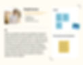
User persona (company)

User persona (creative)

User persona (individual)
Pain points
1
There is no website where all yiqqi information can be obtained in a unified way
2
Lack of reliability appreciated by investors as they do not see a solid platform in place
3
It is awkward to obtain a direct link to download the app
4
It is quite difficult to find yiqqi's social networks in a quick way
_Market research
Through the study of competitor's landing pages, we have been able to detect some aspects in common that can be useful to define the MVP solutions.

Common features
1_Main message and CTAs, located above the fold. Ensuring that it can be seen with no need to scroll.
2_Shocking image creating emphasis, generally in vibrant colors and explaining the virtues of the product.
3_Tiered layer cake layout, generating rows that vary their layout in relation to the information they want to convey.
4_Main menu located in the header and the main contact information in the footer.
Starting the design

Wireframes

Usability studies
By conducting the usability study with the hi-fi prototype, we were able to summarize the most important findings to improve the design.
Findings:
1_Separate the different sections with lines to help users understand the content.
2_Repeat the CTAs buttons at the end of the screens to facilitate the download of the app.
3_Include the information in order of priority.
Design solutions
1_Content: yiqqi's slogan, description and CTAs located above the fold to ensure that the essential information is visible without scrolling.
2_Navigation: Main menu with 'About us' and 'Equity crowdfunding' sections at the header, using a hamburger menu for smaller screens. The access to the social networks will be located at the footer.
3_Layout: Tiered layer cake layout to show the screenshots with the app explanation in a flexible and attractive way.
Final design


_Conclusions
Unifying all information about yiqqi on a single platform helps users to find information related to yiqqi more easily and directly, increases the company's credibility and facilitates the finding of investors for the start-up.
_Next steps
After this first version, we iterated towards a new design with interactive content (which is the one implemented today). In the future, we plan to continue iterating, if we see the need to explain new features or values. To do this, we constantly collect feedback from users (through surveys), who access the landing page searching for information related to yiqqi.
We also keep measuring the web site through the following metrics (KPIs):
1_Conversion rates: to measure the percentage of users who download the app from the page.
2_Time on task: to measure how much time a user spends reading the information in the home page and navigating to the footer of the page.
3_Conversion rates: to measure the percentage of users accessing social networks through the site.